Roll 20, Foundry, and Tabletop RPGs
Analyze collaborative gaming tools, assessing the effectiveness of their voice and quality of their copy.
ROLE
UX Researcher,
UX Writer
RESPONSIBILITIES
UX Research, Content Design
TOOL
Figma
OVERVIEW
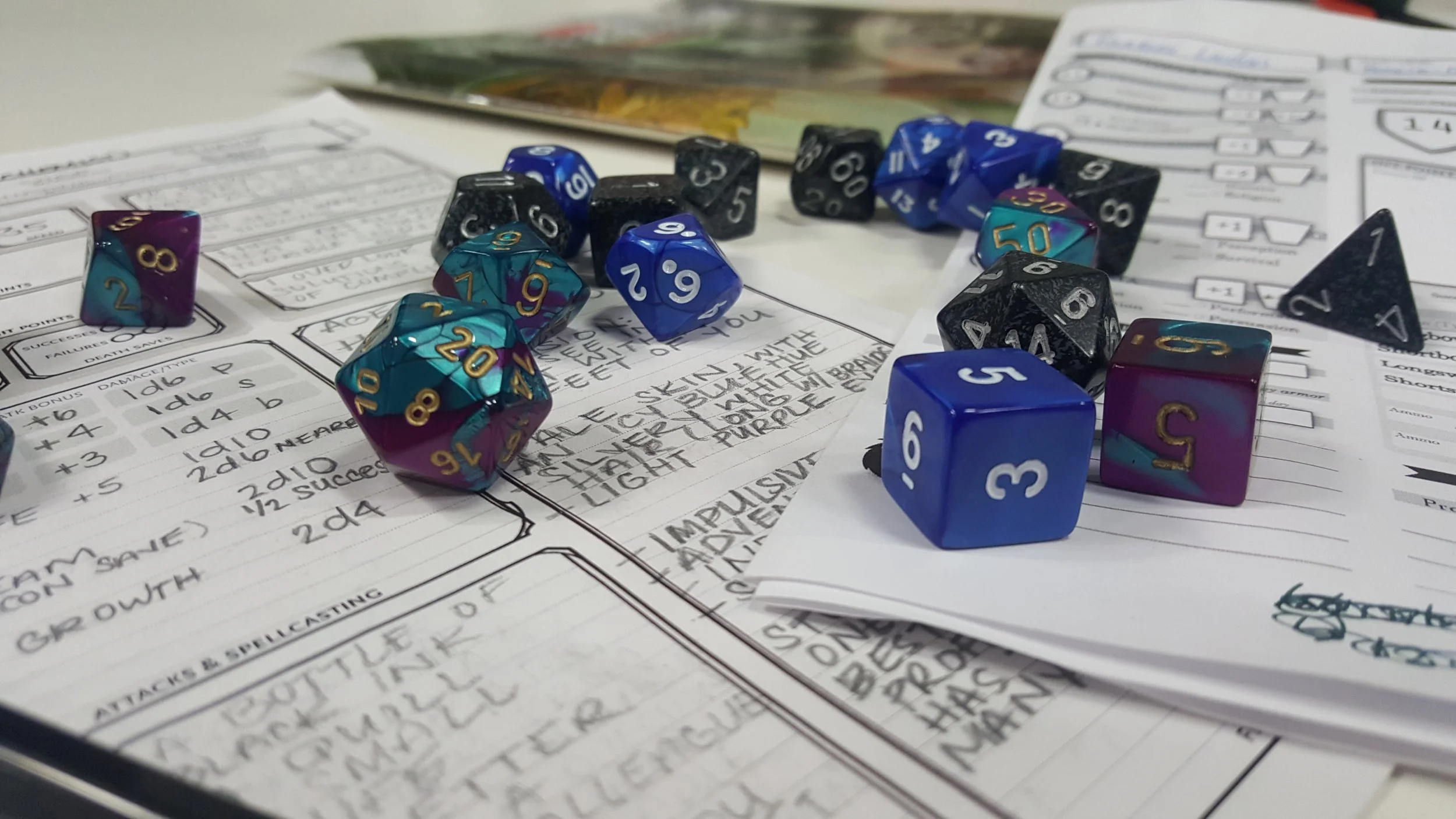
Tabletop roleplaying games (TTRPG) focus on collaborative storytelling. Spinning yarns and crafting rip-roaring adventures. In the last 10 years, sites to support these games have become common place, shepherding in a post-pen-and-paper era. In particular, I’ll be reviewing Roll20 and Foundry, two similar sites positioned slightly differently within the market. Both sites are often missing out on something essential for a good TTRPG: a strong voice. Not in the Pavarotti sense but in a punchy, storytelling sense. The goal was to iterate on copy across the landing pages of these two sites and use that to inform an information redesign incorporating the lessons (be they good or bad) gleaned from these sites.
COMPETITIVE ANALYSIS
Roll20: The most popular TTRPG site, it has a long established history as top dog. This is reflected in its minimalist messaging and its reliance on metrics and partnerships to advertise its ubiquity. Very little attention is given to crafting a strong voice across the pages. It attempts to direct the user to their games as quickly as possible. Given Roll20 has a marketplace and forums to find new games, this feels like a missed opportunity.
FoundryVTT: The new kid on the block, Foundry has positioned itself in the same sphere with different tactics. Whereas Roll20 is focused on a streamlined, sleek appearance, Foundry plays into the selling points of its product when conveying its site. Its strengths are that it’s customizable, moddable, very “tweakable” by those with the technical expertise. As such, its site often has a fairly barebones (in a design sense) aesthetic, conveying “developer” whereas Roll20 conveys “product”. What neither convey, however, is the excitement of actually playing these games.
LANDING PAGES
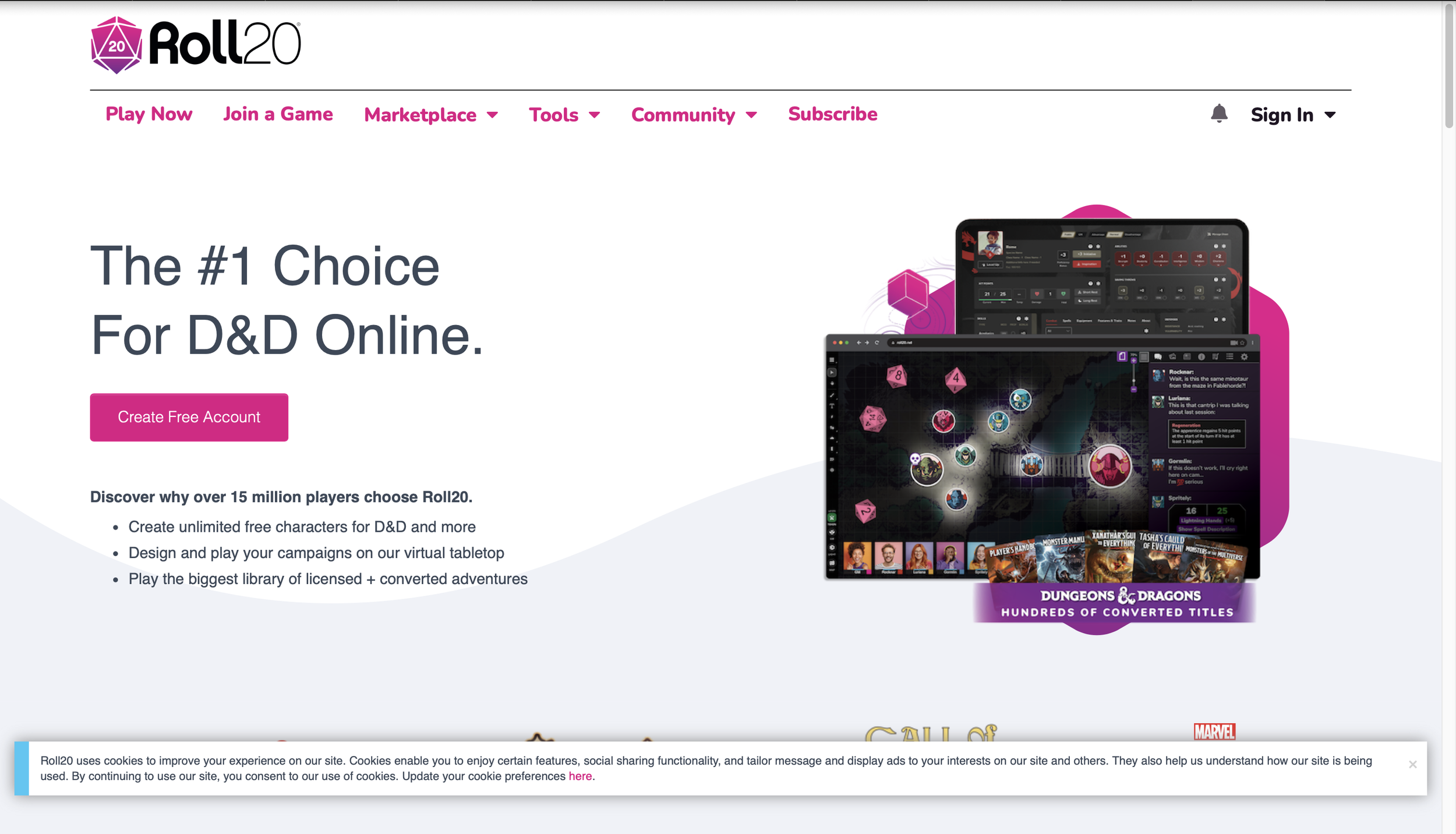
Off the bat, Aaron Judge style, there are several issues with this site. The storytelling is conveyed mainly through metrics and images and is centered around D&D. The other Non-D&D content is even obscured by the banner at the bottom. Now to the copy. Is the user truly choosing Roll20 because it’s already the most popular? The copy focuses on what it’s achieved in equal measure to what it can provide. Where is the appeal to the emotional experience? A slightly more personal set of copy that focuses on features of the product would help create a parallel feeling to what using the product is actually like.

Foundry also has issues of its own. Its landing page barely even discusses the product or why to use it. A user showing up without much knowledge of the site would struggle to understand exactly what is being provided. Self-hosted? Modern? The explanatory text at the bottom could easily be reformatted into a slightly more prominent, eye-catching set of text. Like Roll20, Foundry makes very little emotional appeal in the vein of its product. In a contrasting sense, Foundry is more focused on its software offerings, whereas Roll20 is more focused on its partnered offerings and popularity. These aren’t bad in a vacuum but a holistic approach balancing these would create a more compelling experience.
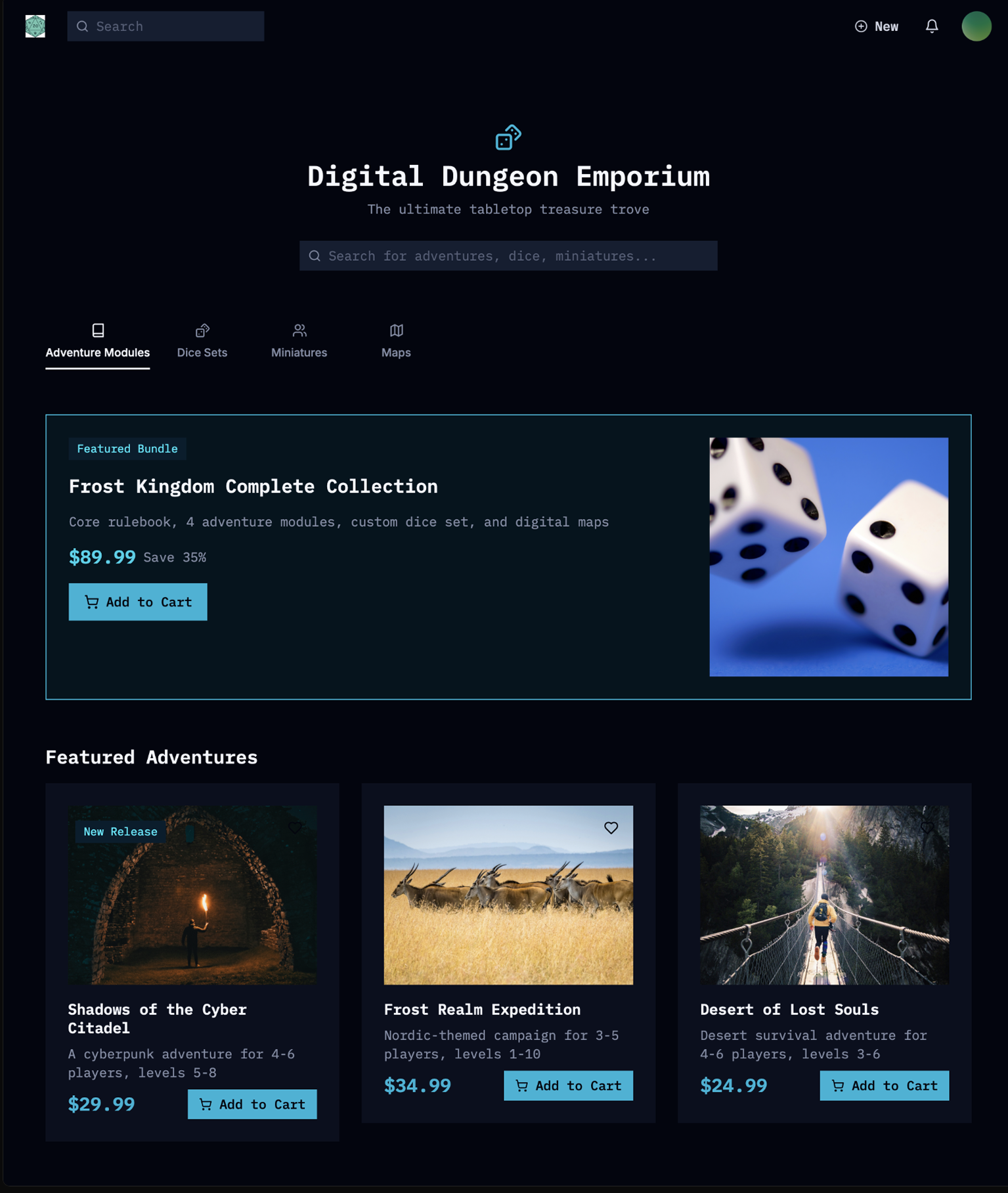
MY LANDING PAGE

In my attempt at a more engaging roleplaying, I played up the idea of camaraderie and storytelling with friends. It reads a bit in the middle of the Roll20 and Foundry versions. It focuses more on capturing the mood the product will generate than conveying a list of features, which is alluded to up top in the feature tab. I thought Roll20’s spotlight of other game systems at the bottom was a useful idea, which I included in a modified form. Overall, I think the result is more evocative at the cost of explaining the features in as much detail as Roll20. As such, however, it isn’t as tied to a single system as Roll20 was. I focused on conveying excitement in my copy, hoping that the text in a bold color scheme would entice the user to delve deeper into the product. This contrasts with Foundry’s approach, which felt both vague without a strong hook to counter that.
LEARNING
The trade off between evocative, pithy text and explaining features and explaining the plaudits of the product are complicated. Trying to do all 3 can compromise a singular voice from emerging, not to mention causing it to simply become too wordy. Clear copy that interests the user in pursuing the product further is a great start, but capturing a similar mood in selling the product that the product itself will convey is a challenge. This stylistic parallel was attempted in my landing page, focusing on the storytelling and collaborative aspect of the product in an attempt to allude to the future experience.
EXTRA SCREENS


How can we condense information and tools without inhibiting user navigation?
On this pageindustry OverviewCompetitive Analysislanding pagesResultLearning