PROCTER AND GAMBLE
Develop a product quiz for small business owners.
ROLE
UX Writer, UX Researcher,
UI Design
RESPONSIBILITIES
Conte Design, UX Writer, User Research/Interviews, UI Design
TOOL
Figma, DevOps, Agile

OVERVIEW
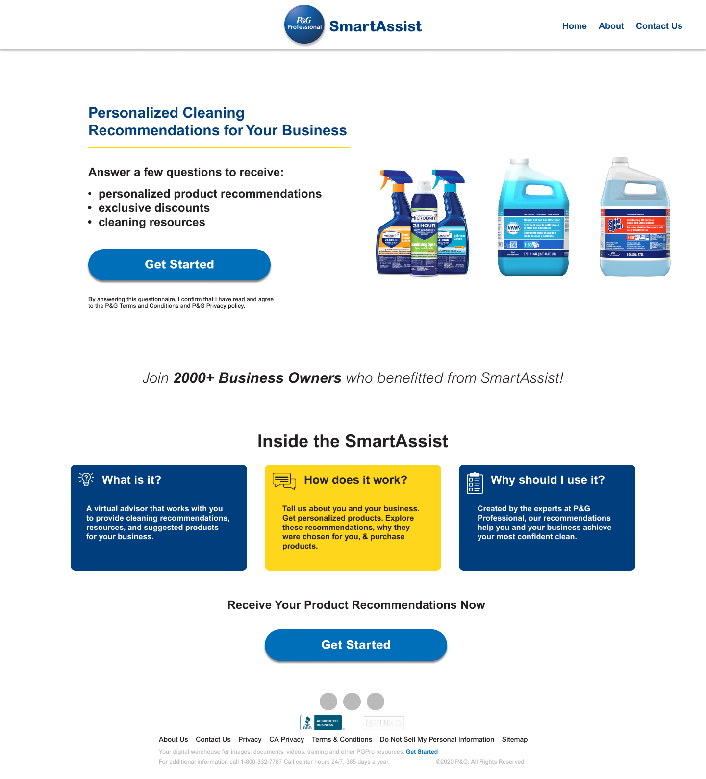
During my project working with Procter and Gamble (who I’ll call P&G), I conducted extensive UX Research and Interviews regarding an existing product quiz, developed user personas and user flows, synthesizing this information into a total redesign presenting several options for mobile and web.
PROBLEM
Lack of quantifiable success.
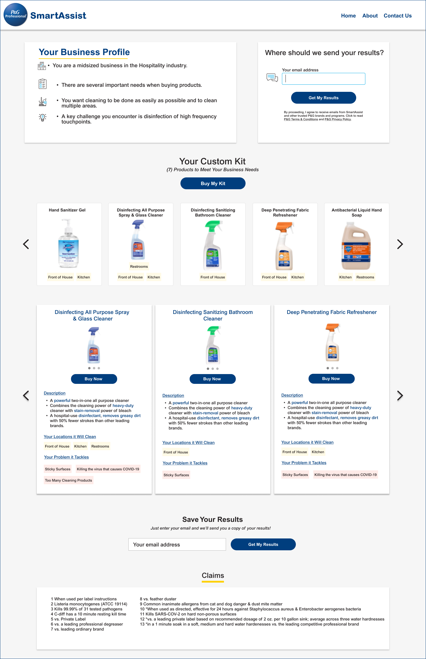
This P&G team at a base level didn’t have a strong look and feel in mind for the quiz. Their main goal was conversion rates, namely the email capture at the end of the quiz. P&G did not make money from any products sold, the recommendations were to external sites selling the P&G products. Their only outcome needed were collecting emails. In this field, their conversion rates were sorely lacking.
WHY IS THIS IMPORTANT?
For P&G, who is making no revenue from this product, they have one goal in mind. To not meet this goal means the product quiz is a resource drain in which value is not being generated.
Solution
User empathy and research
This P&G team neglected the groundwork UX research at the beginning of their initial design. This led to several avoidable mistakes, the main one being the user felt their time was being wasted with an overly lengthy product recommendation quiz. User interviews, personas and journey maps helped convey what a user wants from the quiz. Our design emerged from that.
WHY IS THIS IMPORTANT?
For P&G, the benefits of the quiz may have felt intuitive and as such the design for it did as well. However, the results were not what they wanted because they failed to understand the users here. The users want this solution to speed up their shopping, not slow it down. Providing the most accurate product possible doesn’t matter if they user is leaving after question 16.


Next Steps
Balancing user feedback with a streamlined redesign.
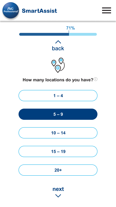
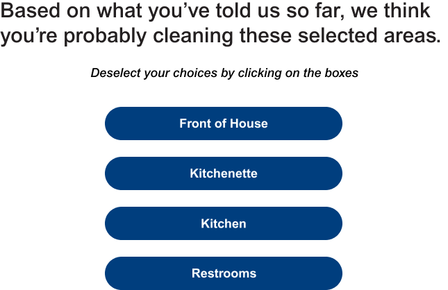
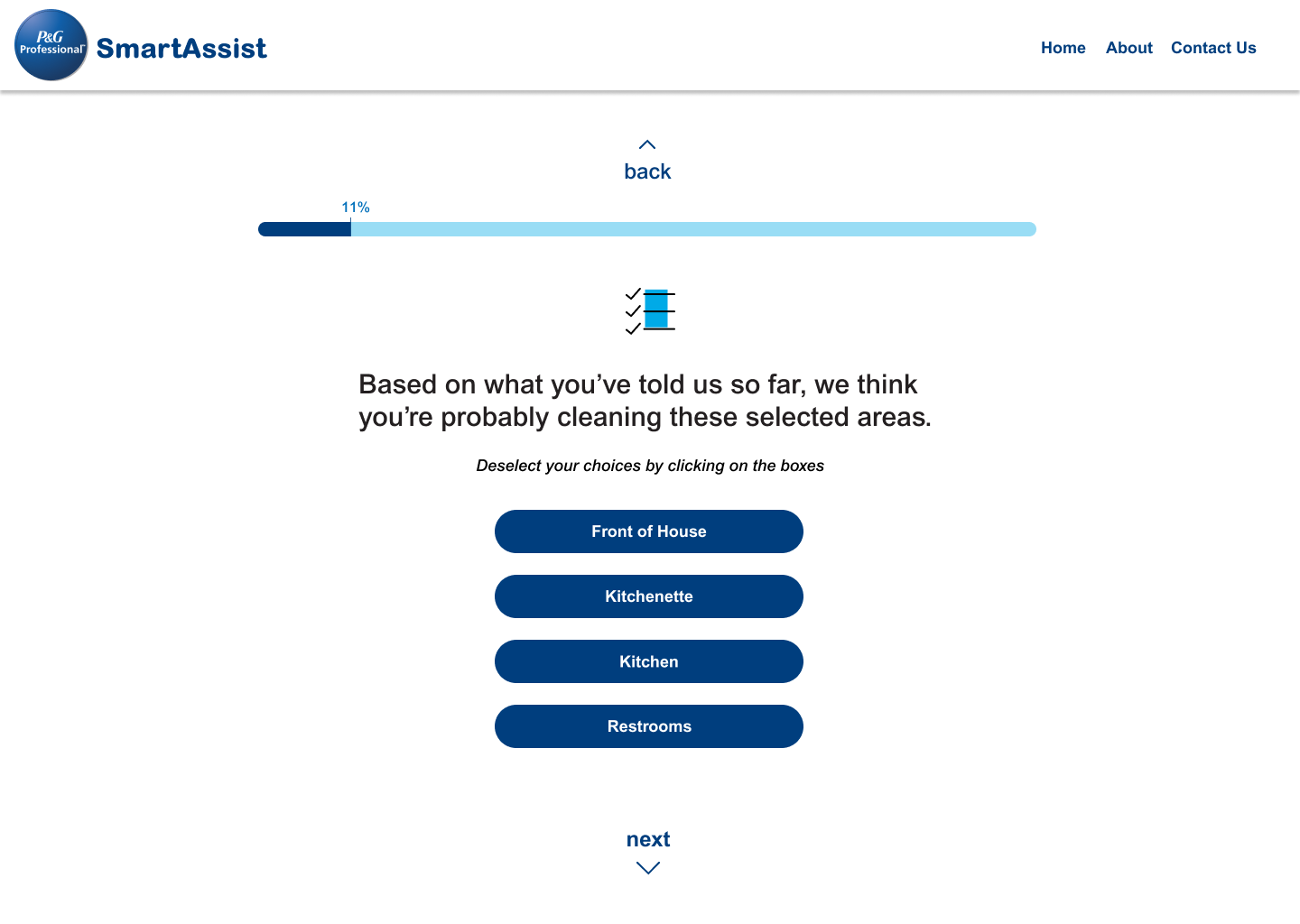
Through our user testing and research we received several valuable pieces of data. We understood the users felt the questions were vague or seemingly unrelated to finding a product and we even saw about at what point users would drop off of quiz. We streamlined the number of questions, reworded them for higher relevancy, and added a progress tracker to show how near they were to finished.
USER SCENARIO CONSIDERATIONS
For this project, we needed to consider that users, especially small business owners, have a limited amount of time. They are looking for a recommendation and are not willing to invest inordinate amount of time to get one. The value to the user needs to be self-evident during this entire process.


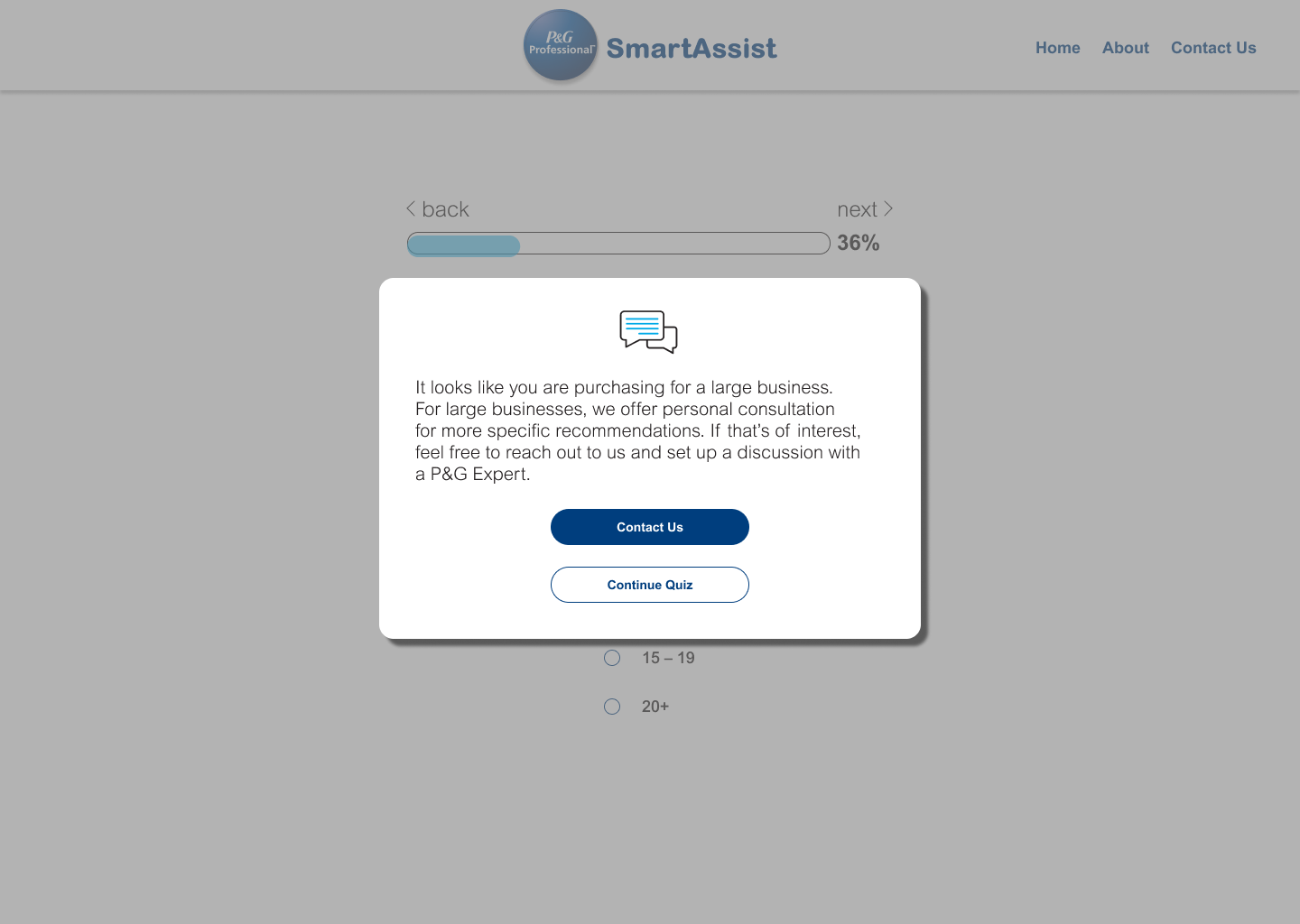
USER CHALLENGE
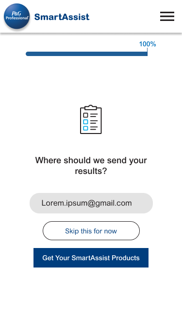
How can we naturally lead users into providing their email?
SOLUTION
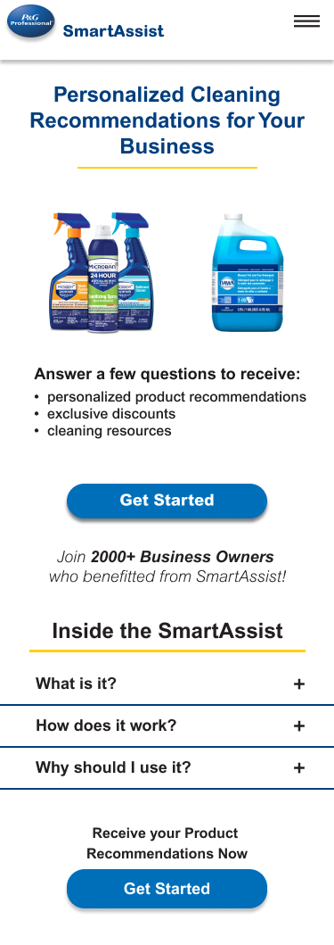
Provide utility and clarity without forcing user information
It may seem counterintuitive (maybe not, it may seem obvious), but competitive research widely showed that demanding an email to proceed is where the largest amount of users bounce from a product quiz. We changed it to be optional with a method to add email at the prompted page or to do so later, and provided an option for users to see the relevancy of a question.
USER SCENARIO CONSIDERATIONS
Users do not like to feel as if they are being forced into something. Maintaining their autonomy means that the value this site provided never becomes a trade off. They are able to navigate through this site while feeling the site isn’t asking anything of them. They are the ones benefitting.
FURTHER EXAMPLES
Brevity, clarity, in responsive conversation.
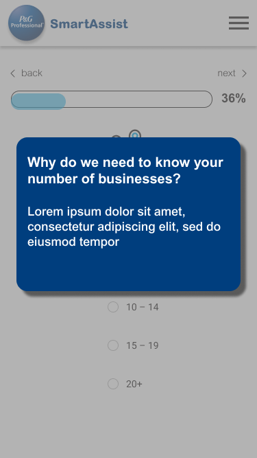
It addition to letting go of the reins a bit, we also had to follow a less is more approach. Users bounce from webpages at record speeds. The back button is the third most popular online. As such, we need to make sure the design AND the content reinforce a speedy end result. We also needed to emphasize the responsiveness to the user, the fact we ARE listening to their inputs.

Conveying Responsiveness. This was kept generally succinct.

Conveying value and utility. This was a bit longer and written with a few directions from P&G in mind. Our testing found users weren’t always positive what the SmartAssist was even after landing on the page. As such, providing some Q&As helped.
TECHNICAL CHALLENGE
How do competing designs maximize user conversion rates?
SOLUTION
A/B testing and user interviews to narrow down the optimal redesign.
In this project, I designed options along the way. Initially three, narrowed down to two that were then carried along to the end of the project. The P&G team were not the most visually minded or aesthetically focused. They cared more about the content writing and outcomes of the designs. As such, we engaged in A/B testing to measure conversion rates.
USER SCENARIO CONSIDERATIONS
The user is engaging in designs that are in certain ways fairly similar, as such it was important to consider these specific differences and the reasons for each. Do they improve efficiency? Do they provide a clearer sense of value?
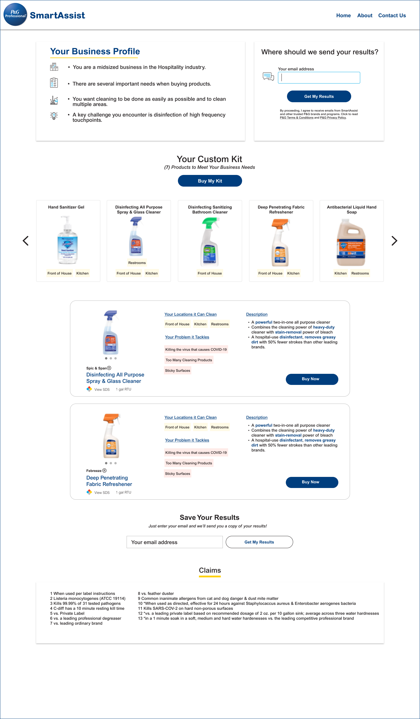
RESULTS
Design chosen and launched on P&G!
VARIOUS DESIGN OPTIONS PRESENTED
CASE STUDY
SOLUTION
Displaying Adaptive Progress
one interesting concern was if the progress bar should be numbered or a percentage based display. We decided on percentage as certain questions would generate a follow up or two. Adding a total number of questions that could expand during the quiz may lead users to feeling their progress isn't actually occurring.
LEARNING
SOLUTION
There is no substitute to user testing.
Many times the UX aspect is ignored or undervalued during a project. This is a mistake. Sometimes designers or stakeholders think they know what a user wants but time and time again, user testing shows this is not the case. Users can be hard to predict, they way they engage with the site intuitively or emotionally is highly variable. Being exposed to these variables (and factoring them into your design) is invaluable in making a user experience that works.
On this pageOverviewProblem/SolutionUser challengeTechnical ChallengeContent designResultLearning